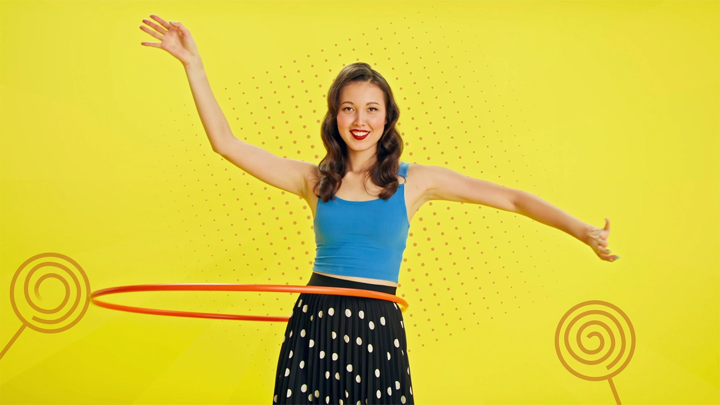
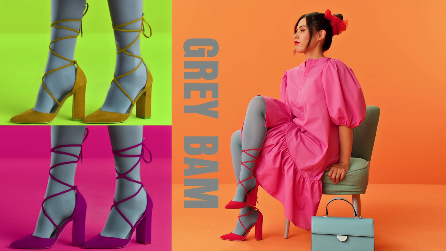
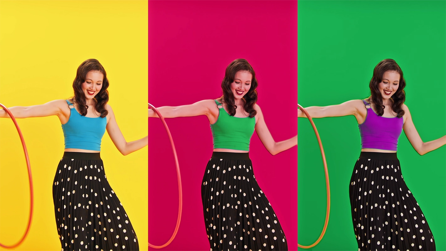
The Juzocolor campaign is without a doubt one of our most uncompromising film productions in terms of color in recent years. Precisely because of the campaign's unique design, we wanted to provide you with some additional information about the inspiration behind the project and Juzo's underlying color campaign. The two image films stand for diversity and joie de vivre, both in terms of the models and the color scheme. Two of the most famous artists of the 20th century served as inspiration: Roy Lichtenstein and Andy Warhol – two luminaries when it comes to pushing artistic boundaries and redefining the entire art scene.
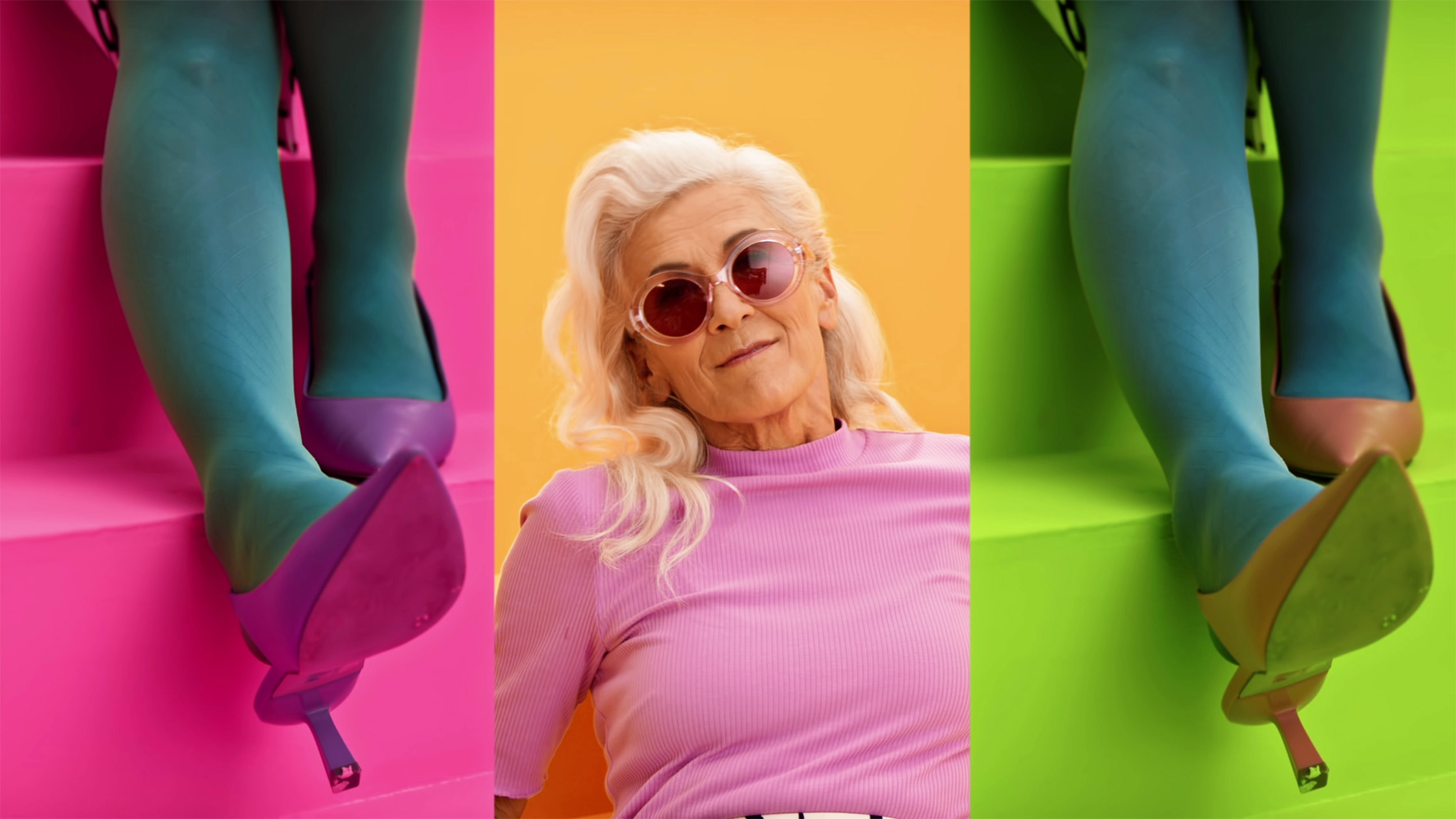
Film production Panda Pictures from Munich and Ulm on the topic of Juzo – show your inner colors: A lady in sunglasses beams in pink, surrounded by legs in turquoise stockings and colorful shoes. The creative concept focuses on vibrant colors.
With this color campaign, Juzo, a leading manufacturer of all types of medical stockings, wanted to redefine the familiar and showcase it in combination with their own products. The Pop Art movement prevailed precisely because of the versatile and striking stylistic elements found in the art.
Pop Art is for everyone
- Andy Warhol
Alongside Roy Lichtenstein, Andy Warhol is arguably the most famous face of Pop Art, an art movement that originated in the United States in the 1950s and 1960s. But what exactly did he mean by the statement, "Pop Art is for everyone"? The Pop Art movement stands for realism, capitalism, and a culture of consumption—everything that stands in complete contrast to the high-minded, intellectualized art movements of previous decades and centuries.
The artists are concerned with popular art —that is, the taste of the masses, rather than just the taste of an elite guard dedicated exclusively to the fine arts. This created an art movement that is intended for, understandable by, and accessible to everyone. That is also why it wasn't about making an impact through subtle images and colors, or through motifs that only become understandable with the right background knowledge. Instead, it was about creating "in-your-face" art. Not subtle, but bold—like a fist through a wall.

Lichtenstein and Warhol shaped an entire generation with their art. Their works remain popular to this day and are copied and shared over and over again. They stand as the inspiration for a social development that has carved out its own space within the artistic realm.
I think that most people think painters are kind of ridiculous, you know
- Roy Lichtenstein
Nevertheless, Lichtenstein made an important point with his statement. Art in general, and Pop Art in particular, can—and should—be absurd! You shouldn't take it, or yourself, too seriously. Our models adopted this exact attitude in the choreography of our films. It’s about fun, joy, lightness, and freedom—all made possible by Juzo .
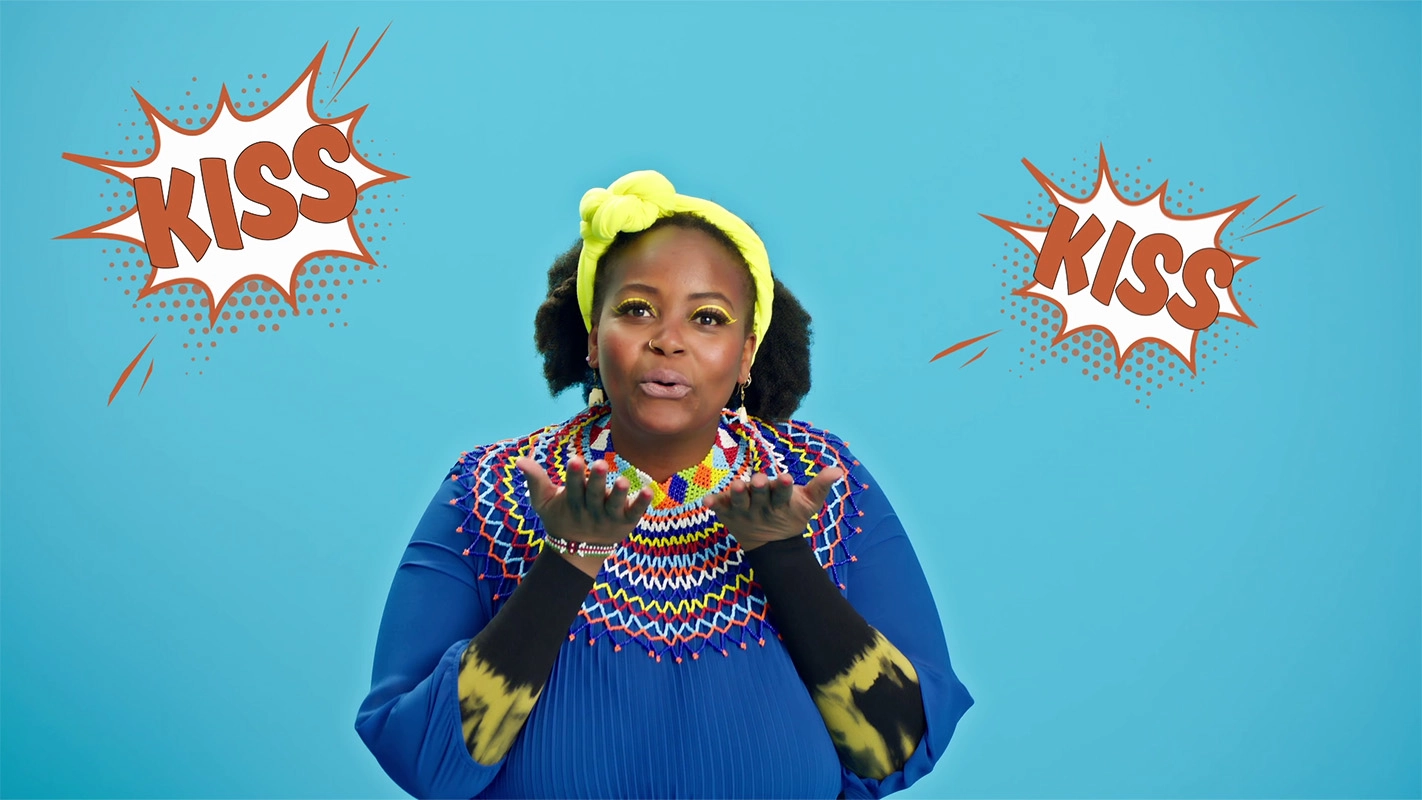
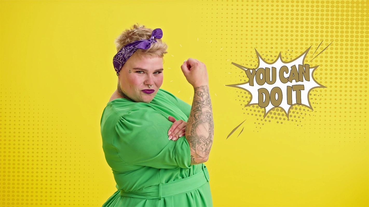
But it wasn't just the basic attitude of the Pop Art artists that was captured in the films. The design itself was also shaped after these two icons. The first film incorporates the most popular stylistic elements used by Roy Lichtenstein, which give his works that familiar "comic book feel." It’s not just the striking, vibrant colors and the speech bubbles with Key Words that are key elements here. The authentic comic feel is created primarily through the black brushstrokes used as frames and outlines, as well as the Ben-Day dot effect. The visual elements for this were created by our post-production team and embedded into the footage. Through color grading , everything comes together seamlessly in the end.
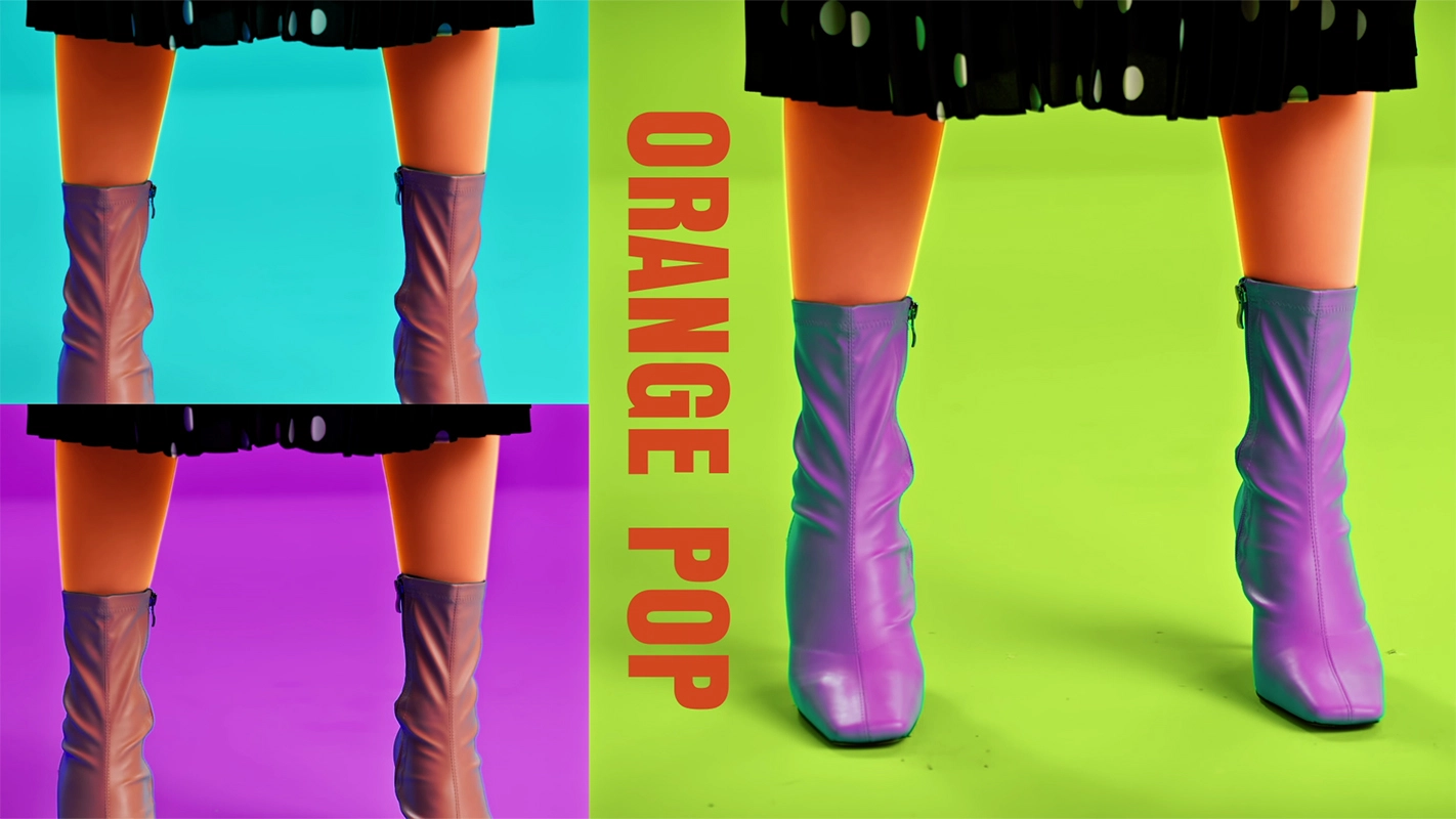
The second film, by contrast, is kept entirely in the style of Warhol and plays deliberately with copying and arranging the same motifs side-by-side and in sequence. The typical Warhol style is also achieved through various color inversions and combinations. During color grading, the color values of individual frames were adjusted with precise attention to detail so that they appear just as distorted as one would expect from Warhol's art, while the color of the stockings still looks natural. In this way, the surrealistic elements are highlighted, and the film's message, "show your inner colors," is brought out in a visually memorable way.