Trend Colours 22 / 23
Panda Pictures produced the Trend Colours product film for Julius Zorn for their "Show your inner colours" campaign.
Challenge
Show your inner colors! That’s not just our opinion, but also that of Julius Zorn.
Julius Zorn, or Juzo for short, has been committed for over 100 years to supporting people through their medical products and helping them regain their zest for life. Their target groups and product range are exceptionally diverse: from compression stockings used primarily for edema, scar, and vein therapy, to braces for all joints, and orthoses that stabilize diseased or injured joints. As a pioneer in the segment, Juzo remains a major presence in both the German and international markets with its versatile product line.
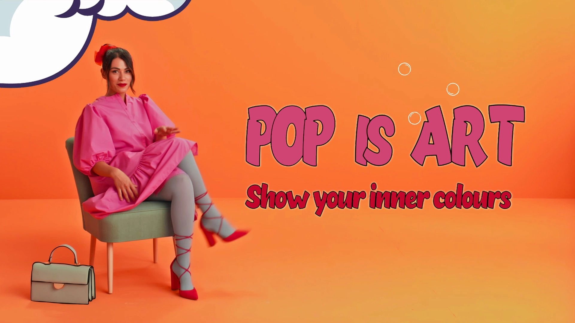
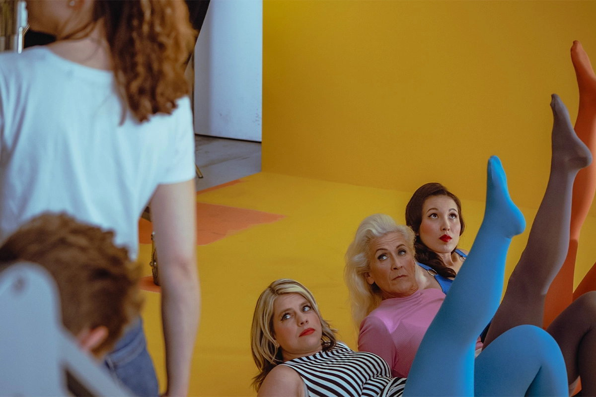
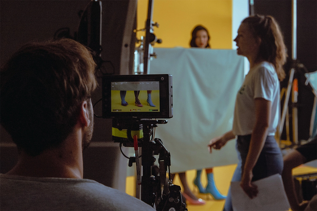
Juzo proves that the topic of "compression stockings" doesn't have to be dry or dusty with their color campaign, for which we were commissioned to produce two product films — and with a real splash of color. The focus is not only on the diversity of the models but, of course, on the wide range of colors available for the stockings themselves. For this reason, the color campaign is headlined "show your inner colours."
From Orange Pop and Yellow Wow to Blue Wham. Pop is Art!
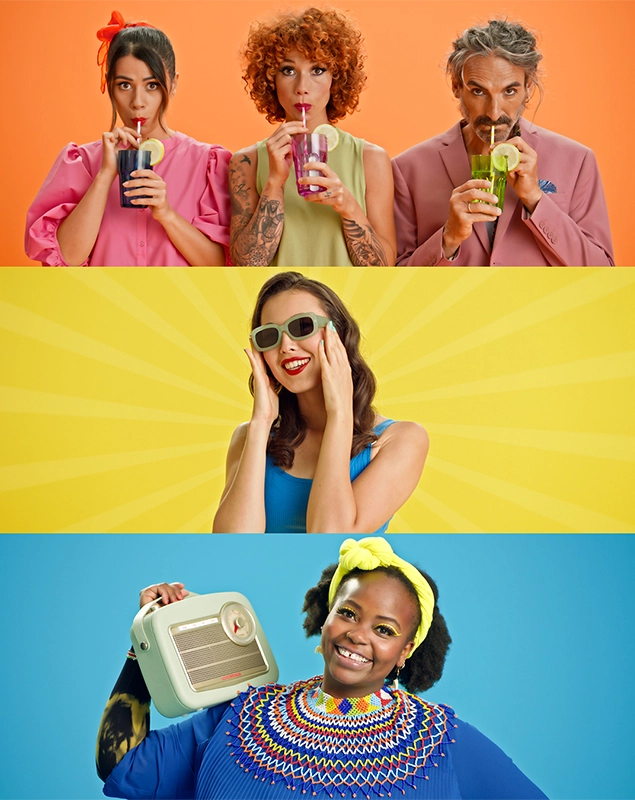
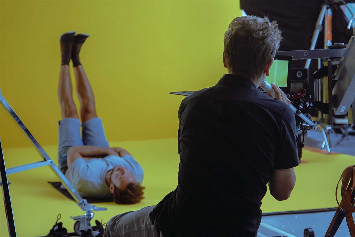
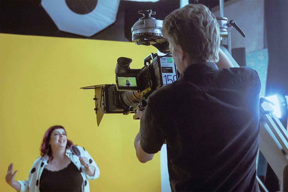
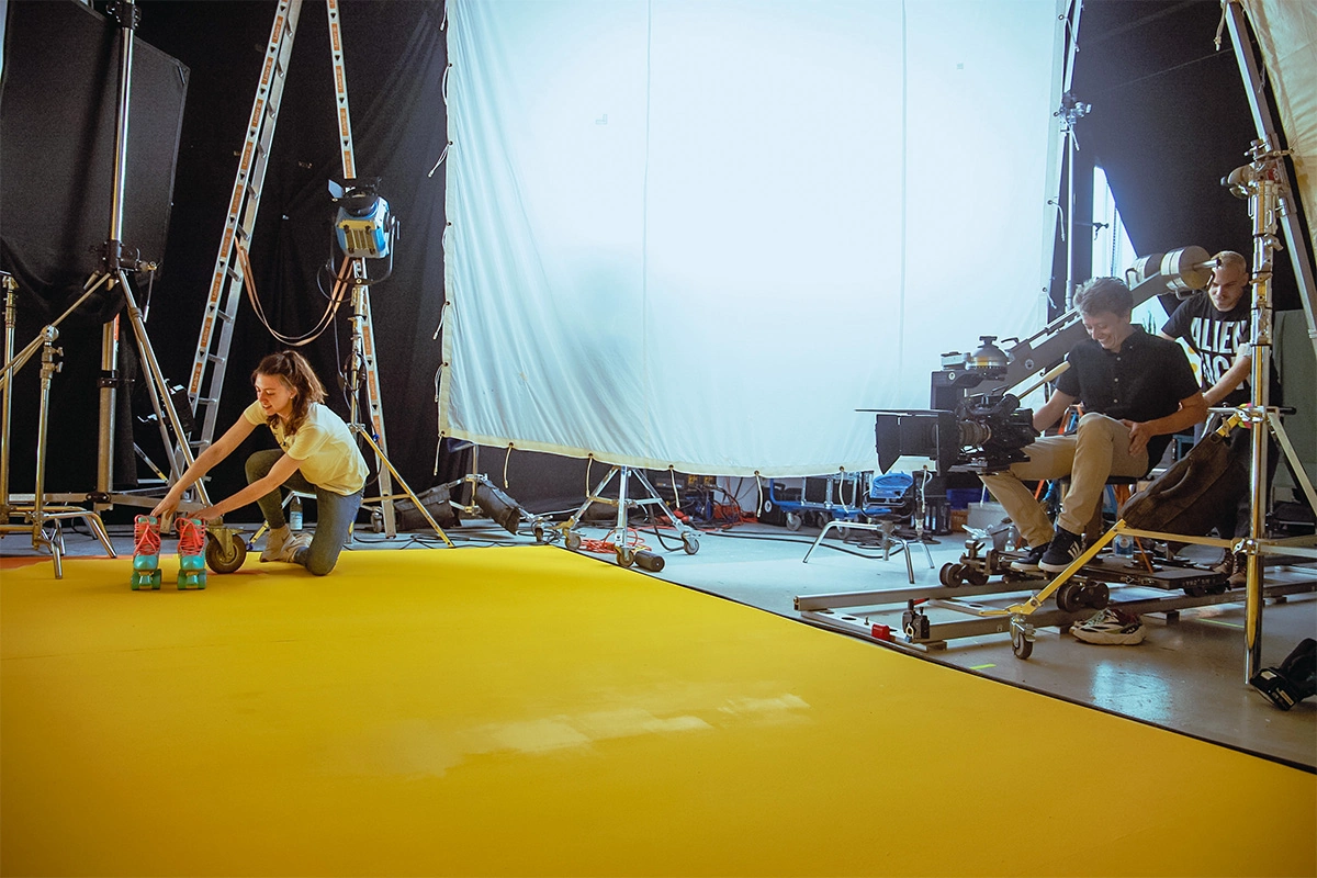
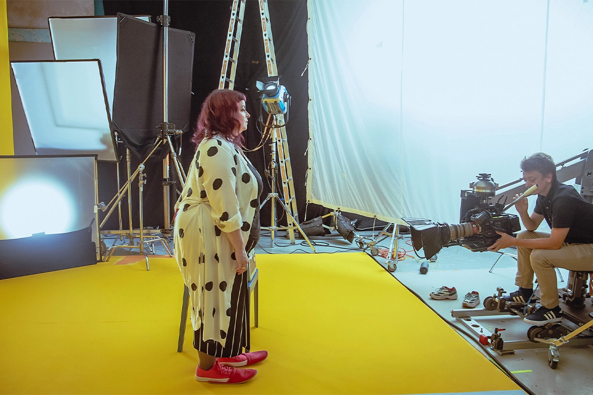
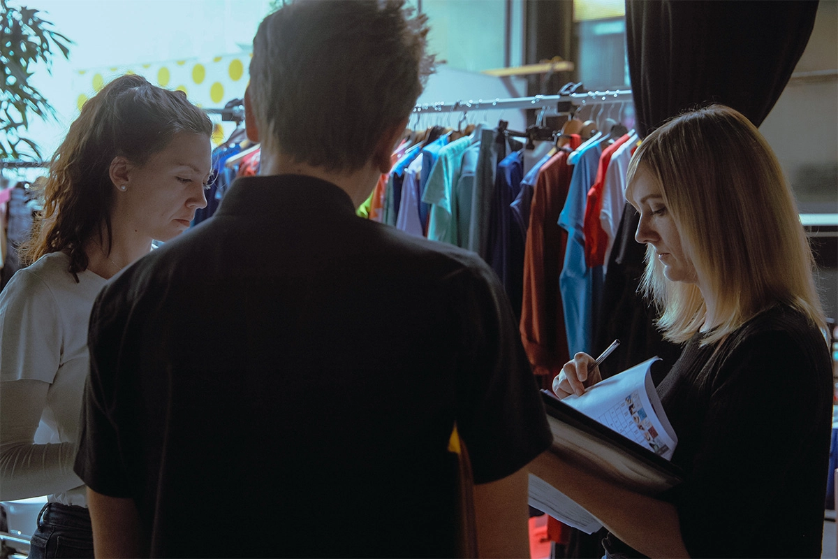
Among the roughly 16 models are not only cast men and women but also actual Juzo customers who demonstrate in the films how much lightness and joy Juzo products have brought back into their lives. For the various scenes, several (naturally very colorful) outfits were put together in advance for the models, including numerous accessories—from Lolita heart-shaped sunglasses to colorful rollerblades. After all, retro is back! Equipped this way, the models were ready to really let loose. Some of the choreography was created in advance by a choreographer, while many of the movements were developed spontaneously on set during the shoot. In our opinion, the liveliness and energy of the models can be felt right through the screen!

Solution
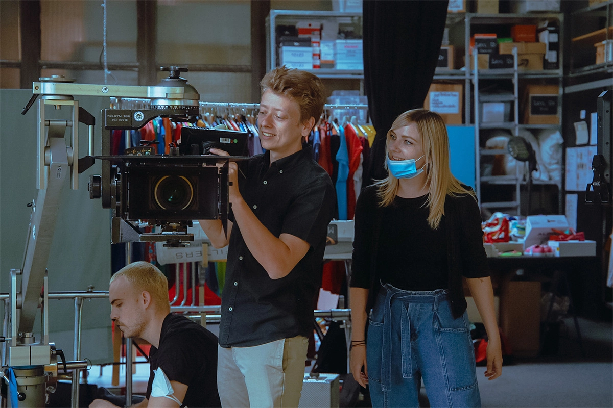
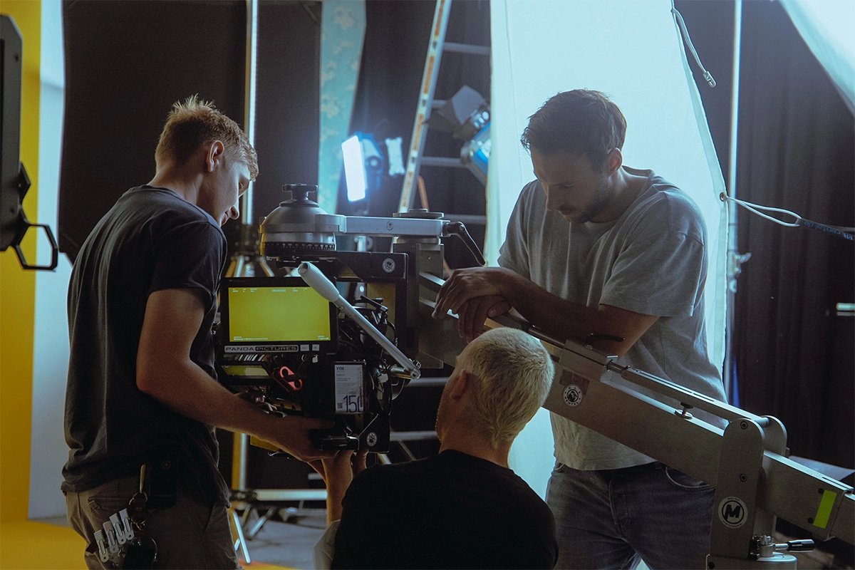
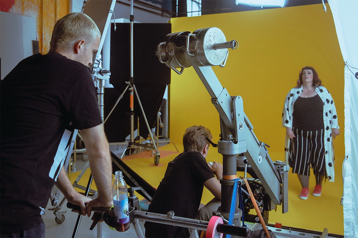
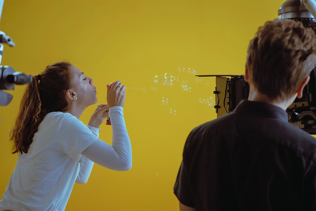
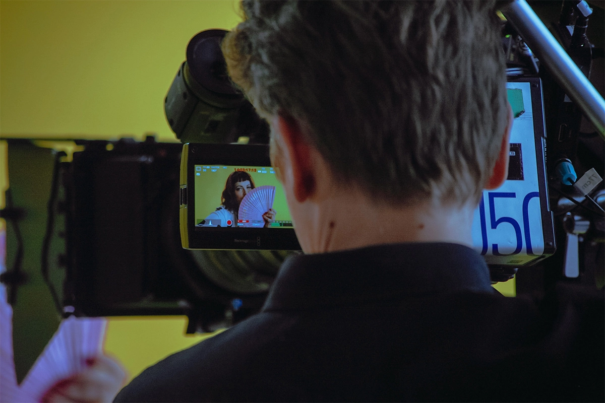
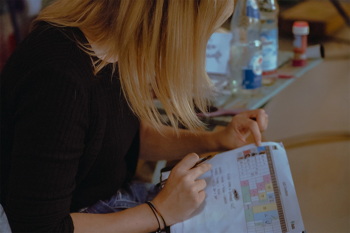
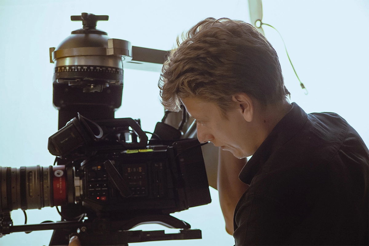
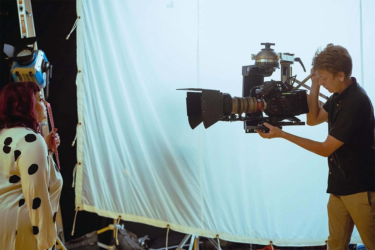
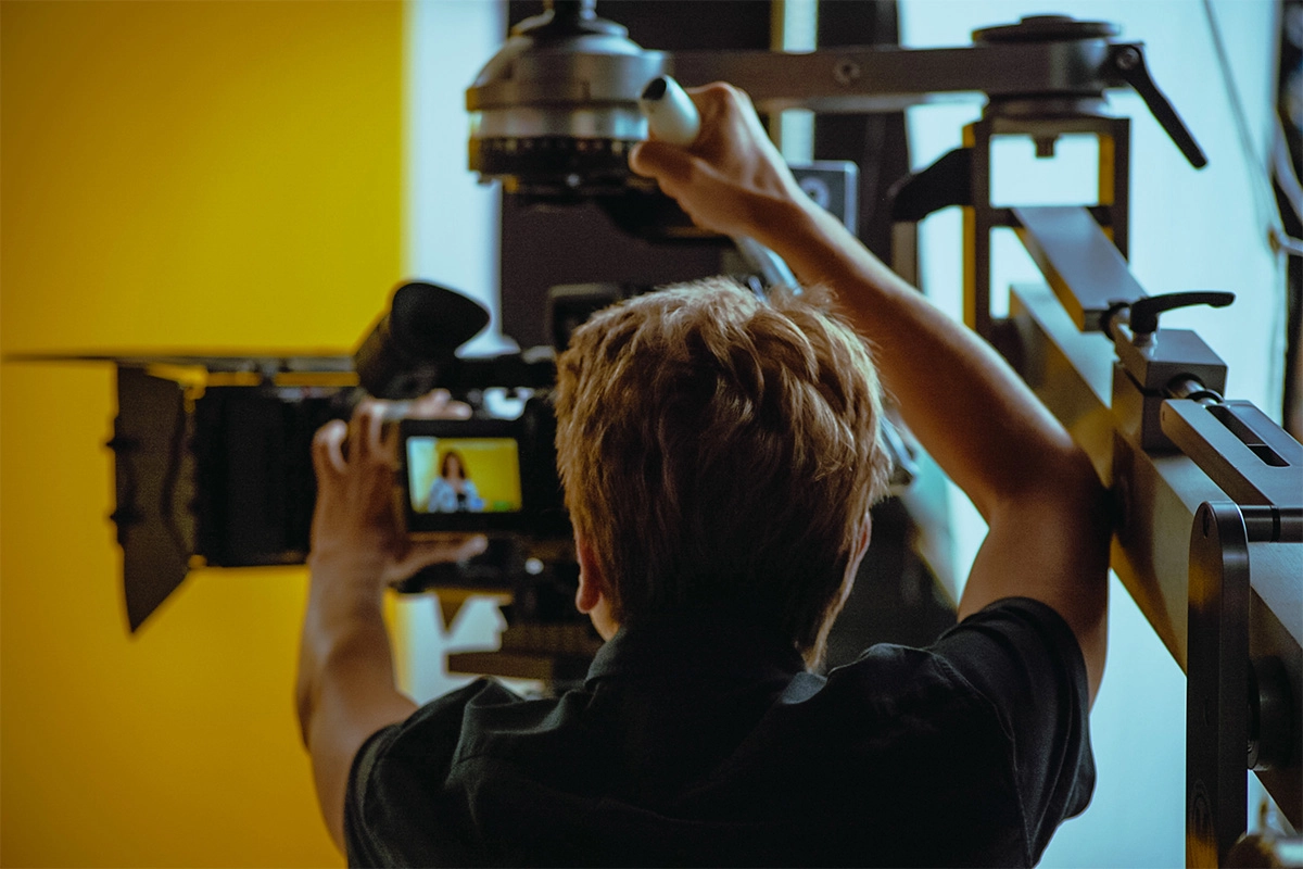
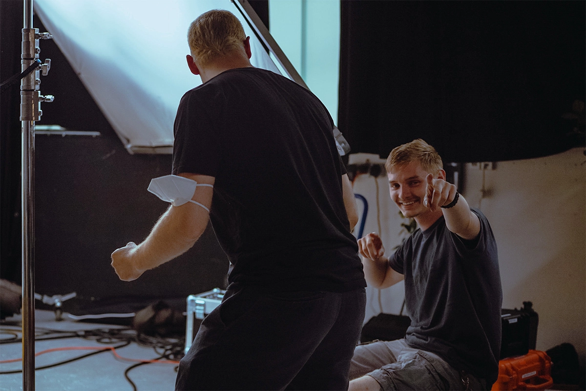
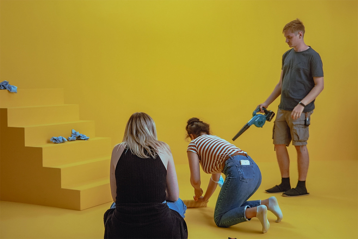
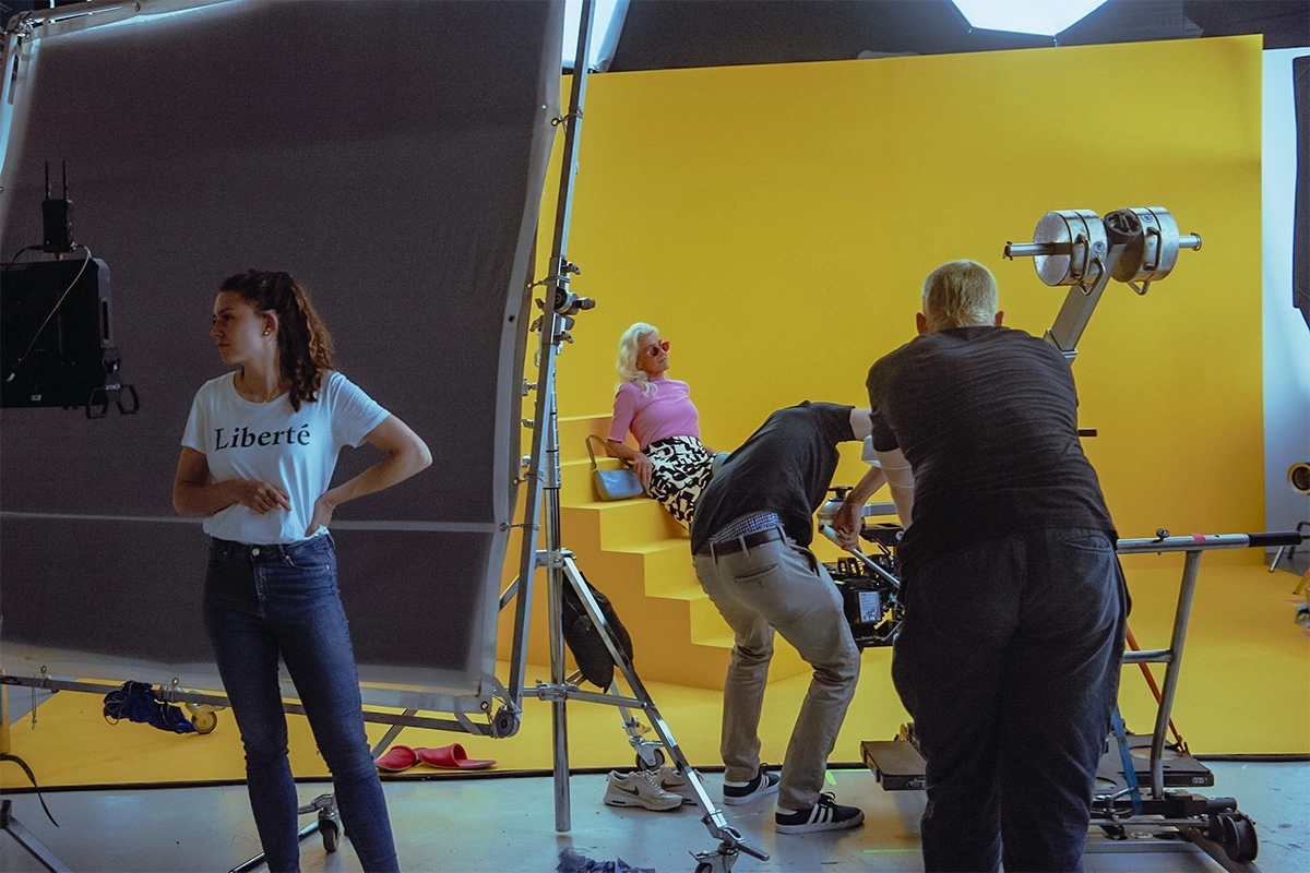
Filming took place over a total of four days in a studio. For the first film, the color scheme of the props and backgrounds was achieved entirely through set design. The walls were repainted each day in a different color and matched to the remaining props for each scene. In the second film, however, we worked with a green screen and replaced and modified the background colors in post-production.
In keeping with the film's theme, pop art stylistic elements were incorporated alongside the colorful models, both through props on set and through animations during post-production integrated into the films. The most iconic faces of the Pop Art movement, Roy Lichtenstein and Andy Warhol, served as the inspiration for numerous elements. From bold color combinations to the Ben-Day dot effect, there were no limits to our creativity.
The visual effects blend seamlessly with the models, backgrounds, and props, creating the retro aesthetic that is visually central to the films. Fast, dynamic cuts emphasize the effects and are underscored by lively music. However, it is the targeted color grading that truly brings both films to life, giving them that essential "pop." Our colorists were able to fully unleash their creativity, becoming gifted students of Pop Art masters Warhol and Lichtenstein in their own right.
If you would like to read more about the artistic inspiration behind the films, feel free to check out our blog !

No items found.